


A poster and concept mapping journey
Questions asked at the 2024 IA Conference and answered there and here

This past weekend, I presented a poster at the 2024 IA Conference, in Seattle, WA, USA.
My “Emotions Concept Map” started with a desire to understand Brené Brown’s Atlas of the Heart. When I was frustrated with my inability to pick specific words to describe my emotions, my therapist had recommended the book as a possible resource.
As I read it, I longed to see the connections between the described emotions and experiences. Thanks to knowing about concept maps, I was able to start diagramming as soon as the hankering occurred to me.
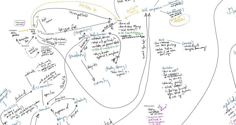
This first diagram is pretty sprawling with lots of arrows crossing and roaming around the page—and the screenshot above doesn't even capture the whole map! Despite that, mapping the emotions got me through reading the book and helped me retain much more of the content than I would have otherwise.
When I presented a tidier map at the conference, folks had lots of questions about it.
Below are answers to some of questions that stood out to me (and that I could manage to remember, a few days after two hours of chatting with my IA pals).
There are many sections here, and this issue of Finding Out is both longer and more procedural than my usual style. So feel encouraged to only look at the bits that draw you in, or even to bail and only check out the poster itself.
Why make this poster?
I made the poster and its refined concept map for a couple reasons.
At first, I thought it was mostly for my colleagues—concept mapping had really helped me, and I think we could all (especially in the U.S.) benefit from a stronger relationship with our emotions.
As I worked on the map, though, and I began to realize I was running out of time to make it all that hoped for it to be. I had wanted it to be a concept map of all 87 emotions and experiences in Brown's book, plus references to other existing emotion diagrams and illustrations. So I started saying to myself, of a slimmed down poster focusing only on the concept map I produced, “Even if it only helps me, it will have been worth it.”
The poster was in part for my community and in part for myself.
Is this your job?
Asked in the same moment by one colleague as “Why did you make this?,” this question made me smile, but I’m not sure I gave a good answer for it. Now I can try again!
Is this my job? Sort of. I have lots of experience making well-explained things for a variety of people. I got a ton of experience and instruction on this from Dan Brown and James Melzer of EightShapes when I worked there. And then I got lots of practice using those techniques in my next job, at NPR.
But this poster in particular was not made for a formal IA or UX position. It was made as an act of service to my community. I think that exploring our emotions is important to my fellow big-feelers—and I've noticed that IAs and UX practitioners often have big, complex emotions. I also think that adding concept mapping to our toolboxes can be so useful for the work we do, both in formal environments and in our day-to-day lives.
So while the poster relates to the work I’ve done, I would argue that sharing our knowledge and experience with our community is just as—or more—important than doing the things we tend to call our “job.” And thanks to a combination of generational wealth and planning with my partner, I have the ability to gift this work to our community.
Wow, let's talk about emotions.
Many folks were interested in the poster’s expression of emotions themselves. Expressing themselves with nuance resonated with folks, and they got interested in the connections between emotions, just as I had.
Some even shared how what they saw related to their own experiences and struggles. I feel so honored that they felt safe sharing this processing with me.
Why this set of emotions?
Initially, I had planned to make a concept map with all 87 emotions in Atlas. It’s what my mind craved when trying to understand the book. But as IAC approached, and I was researching the origin of concept mapping, I discovered the following passage in a paper by Joseph D. Novak and Alberto J. Cañas, emphasis mine:
“Students often comment that it is hard to add linking words onto the ‘lines’ of their concept map. This is because they poorly understand the relationship between the concepts, or the meanings of the concepts, and it is the linking words that specify this relationship. Once students begin to focus-in on good linking words, and on the identification of good cross-links, they can see that every concept could be related to every other concept. This also produces some frustration, and they must choose to identify the most prominent and most useful cross-links.”
I pondered this perspective over the next couple days as I continued to make tiny concept maps for each emotion in Atlas. Ultimately, I felt freed of my initial expectations for the map, and decided that I could choose the emotions and connections that spoke the most to me. Not only would it mean getting the poster done with less stress and hurry, but being selective in the chosen nodes and connections is more in alignment with the initial purpose of concept mapping.
I went through my now finished deck of emotion notecards, and picked out some of them. Most of of my selections made it on the diagram. But as I placed notecards next to their related emotions, I realized that a few of my cards—tranquility, contentment, and dehumanization—didn’t connect to the rest of the map. While they’re important emotional concepts, the arrows of the map made it easy to see that they weren't part of the domain I found myself exploring.
So, as I do when I write essays, I removed these elements from the draft, and focused on the bits that made a conceptually uniform whole.
Why five sides? And why were those five emotions in the corners?
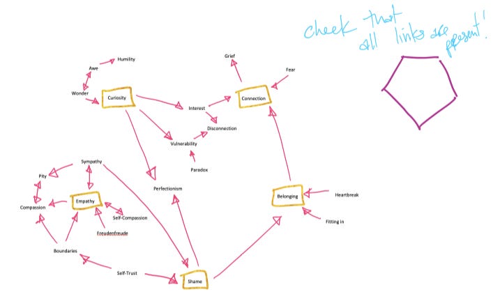
The choice of the shape of the map and the placement of the emotions came naturally out of the process of mapping. First I just got them all on the same plane, using notecards stuck to a window.
Then, when refining the map I (attempted) uncross any crossing lines from the initial arrangement, simply because they tend to clutter the diagram and make it confusing. That got me to the below map.

Once I achieved that, I looked at what I had, and tried to come up with an arrangement that kept those nice straight lines, but also felt cohesive. I noticed that a few of the nodes had more connections than others. They had four or five connections, while others had only one or two. It seemed likely that the emotions with the most connections were worth highlighting, at least subtly. And there were five of them. So, a pentagon felt worth exploring.
And how did you finish the diagram?
Ok, nobody asked this, perhaps because I didn’t have the above detailed steps on the poster. But I want to finish the process story here anyway, so there.
Once I saw the five highly-connected emotions in a pentagon (above) with no overlapping lines but without lot of visual cohesion, I craved a more balanced arrangement within the pentagon.

In arranging it that way, I was taking the gestalt law of proximity into consideration: by distributing the emotions evenly across the concept map’s bounds, I hoped to allow the arrows to indicate the connections between emotions, rather than allowing viewers to infer connections based on how close or far they were from one another.
With a fairly tidy map prepared, I was ready to move completely to digital. This is also where I first started adding in the words along the arrows. Although I had kept that spacing in mind throughout the mapping process, I knew from past experience that including the labels in the diagram at that point would have made arranging the nodes (the emotions) more irksome. And therefore, make the process take longer, which I did not have time to accomodate.

The digital format let me further refine the emotions’ placement. As I did, I discovered I wanted to shift some of the original five corners in favor of emotions that felt more important, despite their lower number of connections.

The above map is pretty close to the final map. From there, I was just noodling, noodling, noodling, getting the balance and readability to where I wanted it to be.
We could use this as input for an AI!
Maybe. That’s part of why I thought this poster was a great match for this year’s conference.
But I also want to remember that emotions are complex experiences—while this map shows (some of) the relationships between (some) emotions, the relationships are only part of an emotional experience.
Emotions are also physical. When we tune in enough to our body, we can feel them as tightness or openness, smallness or largeness, even as hot or cold, and so many other properties. Without these sensations, I’m not sure that the connections between emotions are enough to teach a computational system what emotions mean.
That doesn’t mean that computers (and their pals) couldn’t understand these things someday! At the top of the poster, I quoted the imagined SecUnit in the beloved sci-fi series The Murderbot Diaries. Here’s another quotation from it:
“I know, I said. And I did know, and now I was having an emotion. Like a big overwhelming emotion. It felt bad but good, a weird combination of happy and sad and relieved, like something had been stuck and it wasn’t stuck anymore. Cathartic, okay. This fits the definition of cathartic.”
SecUnit certainly experiences both the physical and mental components of emotions, and SecUnit is at least partially computer.
So, I say, be purposeful and thoughtful when considering how to integrate emotions with AI.
This concept map is different from how I’ve done it. Mine don’t have sentences.
If a diagram with nodes and arrows doesn’t have words written along the arrows, it’s not a concept map! Or, it’s an incomplete and perhaps confusing one, at least.
But if the diagram is helpful and has bits of text and arrows without the arrows labeled, it could instead be a flow (or maybe a journey map) or a mind map (also called a web). Flows and journey maps show the steps of a process or an experience that a person goes through, respectively. A mind map shows how hierarchical things are related, usually starting with a center node.
Flows, mind maps, and concept maps are all useful diagramming structures, and each is best at doing something different. Both Abby and Dan’s books, which I cited on the poster and will link at the bottom of this newsletter issue, have more information on these styles.
My clients don’t understand the concept maps I make.
Nope! They probably don’t. Here’s a quotation from Novak and Cañas that didn’t make it into the poster:
“…new knowledge creation is a constructive process involving both our knowledge and our emotions or the drive to create new meanings and new ways to represent these meanings.”
We make concept maps for ourselves. If we want a client to get value out of a concept map, make it with them. (Thank you to Livia Labate for suggesting this approach to me!) But we can also make a concept map all for our own knowledge creation, and never use it as a deliverable with our clients or colleagues.
Think of a concept map as the sketches we make for ourselves when we’re designing a wireframe. In this case, instead of turning our developed understanding into a tidier diagram, we turn the understanding from concept mapping into an improved ability to work with the client and to make industry-related recommendations.
Finally
I am so grateful to everyone who stopped by my poster at IAC! And if you didn’t make it by on poster night or to the conference in general, I hope the digital version and the answers in this newsletter are helpful (and hopefully engaging, too).
If you have other questions or comments about the poster’s content or my process making it, just reply to this email! I love getting notes from y’all, and I always reply (although it sometimes takes a while, I admit).
Sending you well wishes on your journeys with both emotions and understanding (diagramming) your experiences and knowledge.
Mentioned in this issue: Atlas of the Heart by Brené Brown; Dan Brown; James Melzer; Novak and Cañas’ “The Theory Underlying Concept Maps and How to Construct and Use Them;” the gestalt law of proximity; The Murderbot Diaries by Martha Wells; Stuck? Diagrams help. by Abby Covert; Communicating Design by Dan Brown; and Livia Labate.
Tools used: Index cards (hurray) and drafting dots (I used this combo instead of sticky notes because I knew I would be working with my physical notes for a few weeks, and I wanted to have stickiness only when I needed it); Microsoft OneNote for drawing with a stylus; Google Drawings for diagramming with vectors; and Google Sheets for the poster layout. (Not that these software choices really matter, but perhaps you’re curious.)